
CATER’D
Catering branding, naming and website
-
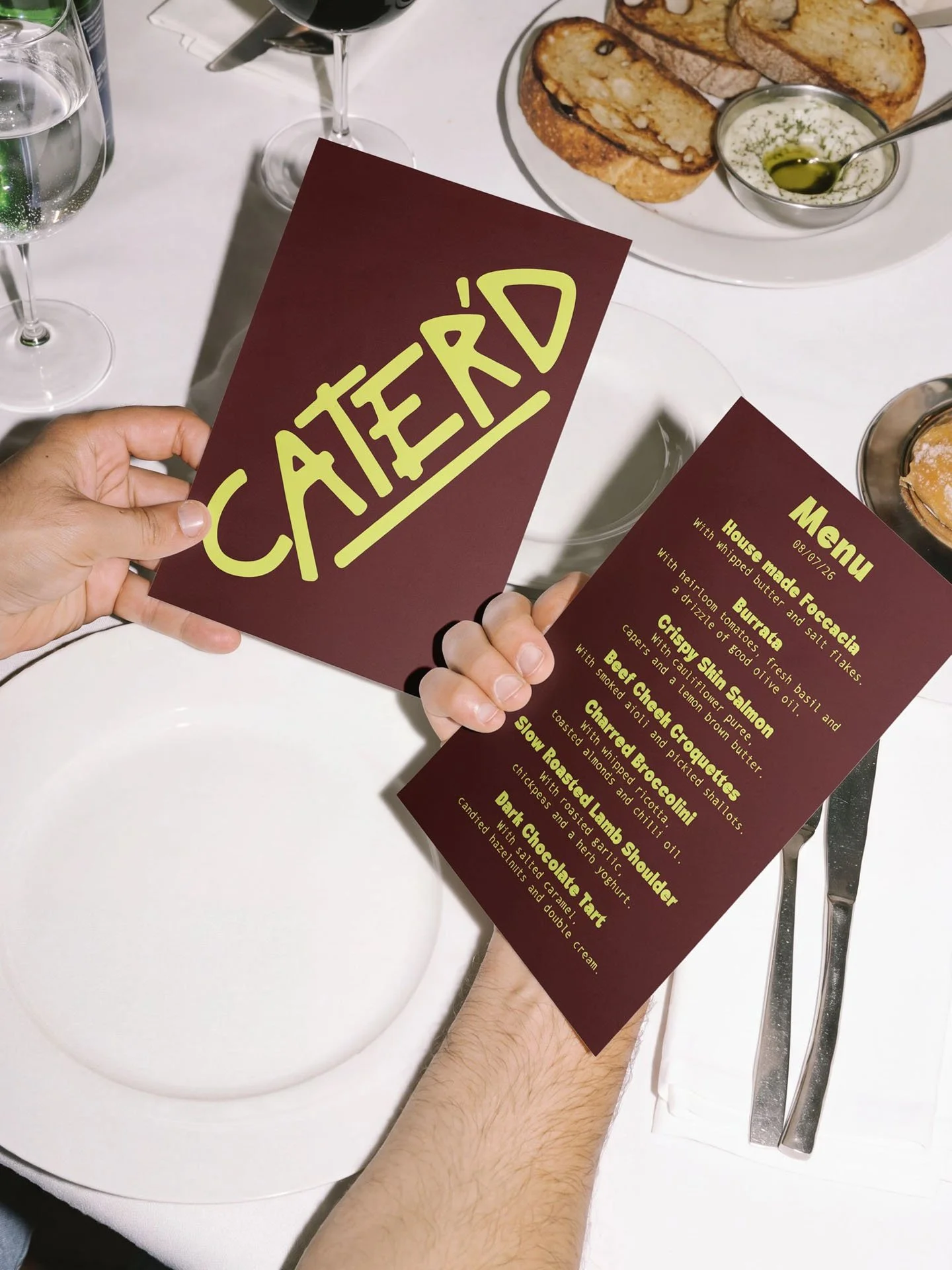
Catering with some attitude. CATER'D is a modern catering business in Newcastle and the Central Coast. We named the business, then built the whole brand around it: identity, pattern, menus, packaging, uniforms and a website.
The idea.
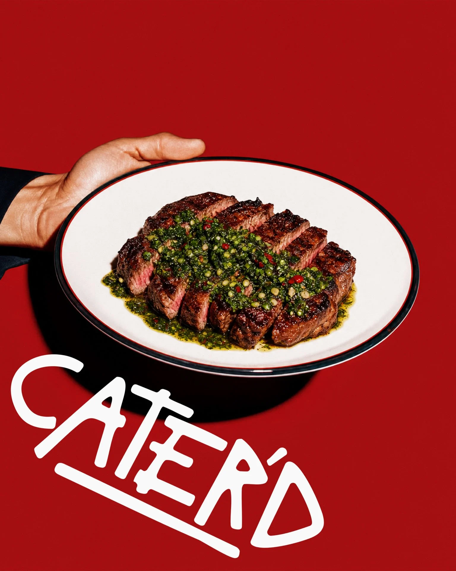
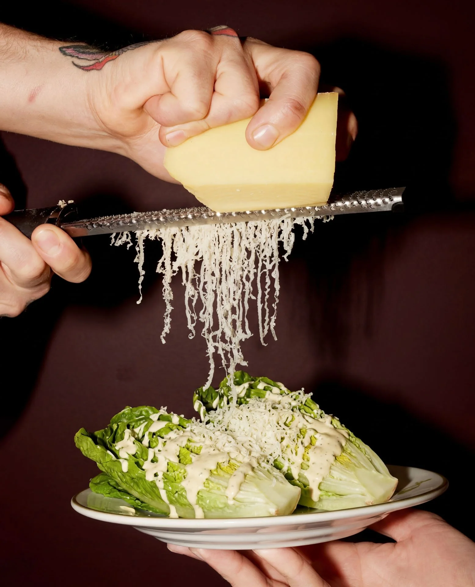
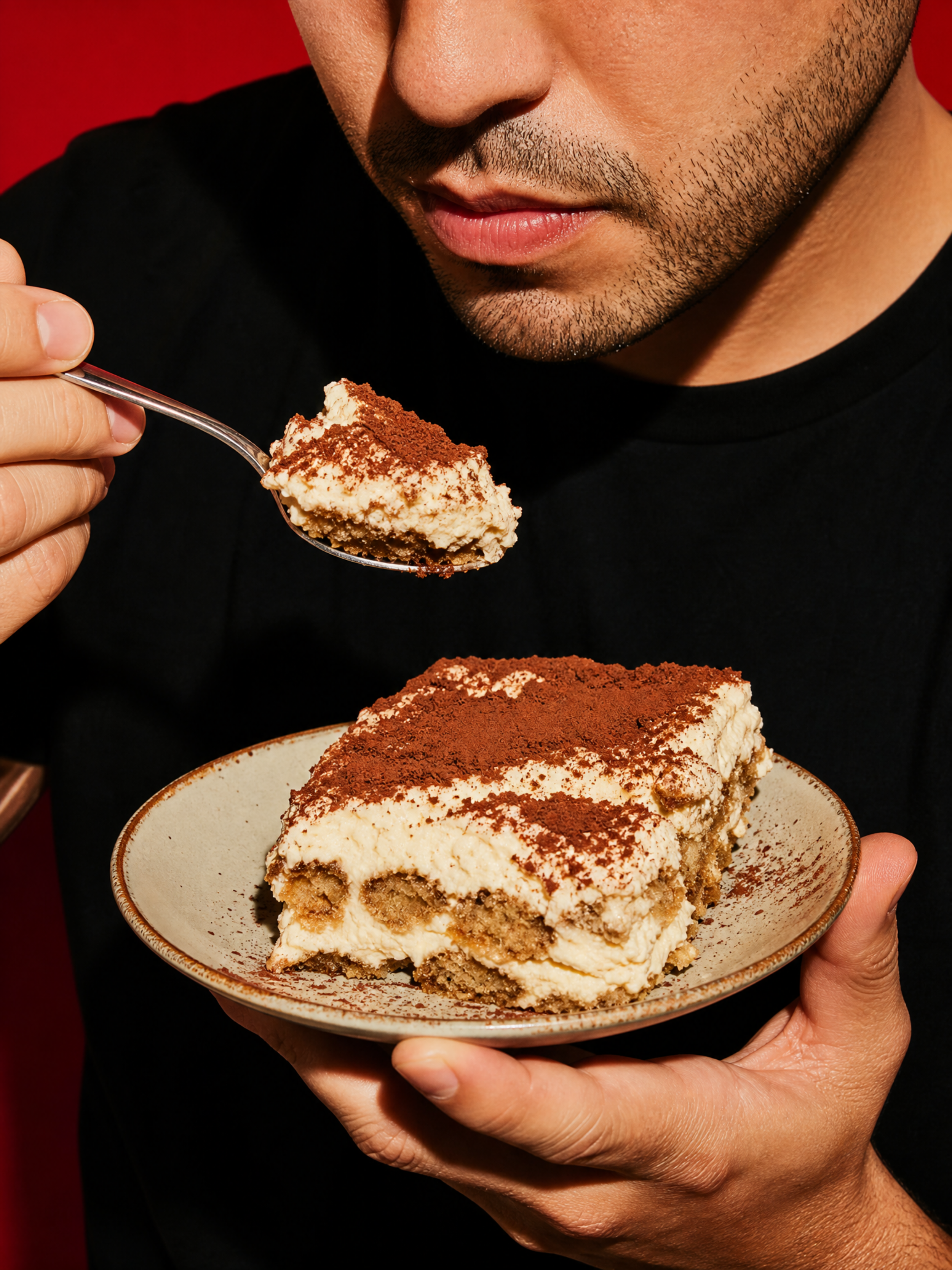
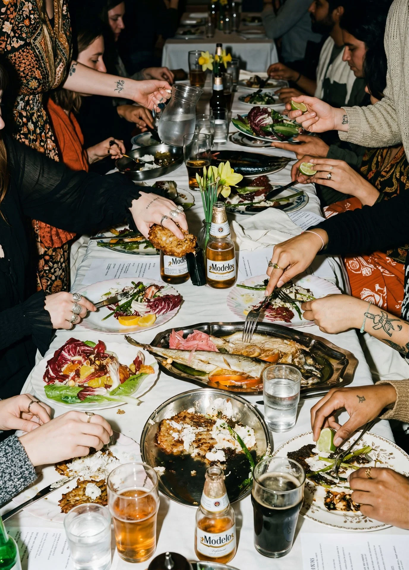
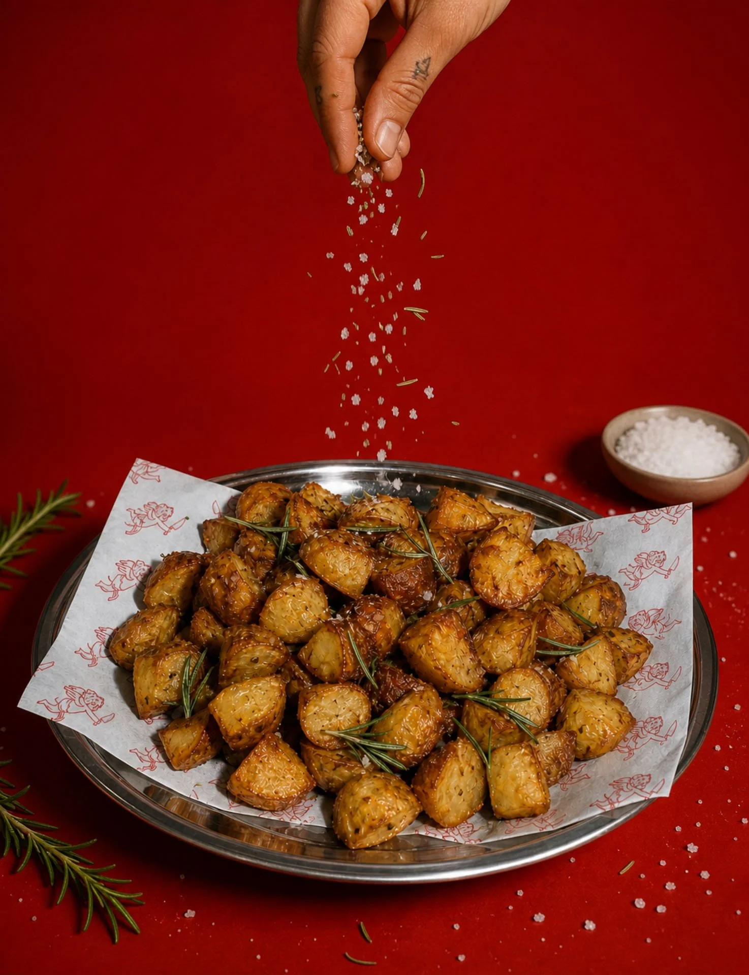
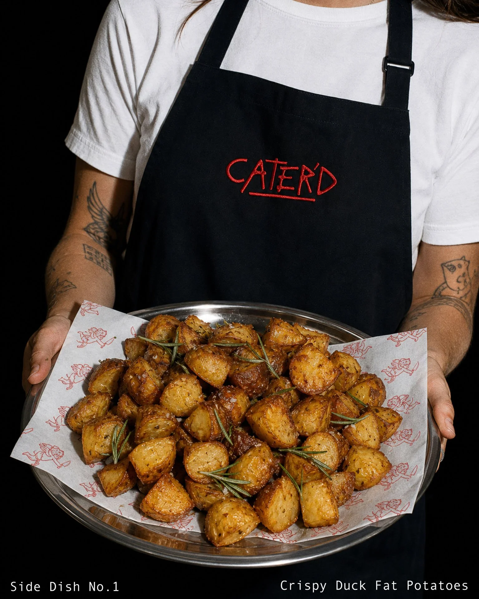
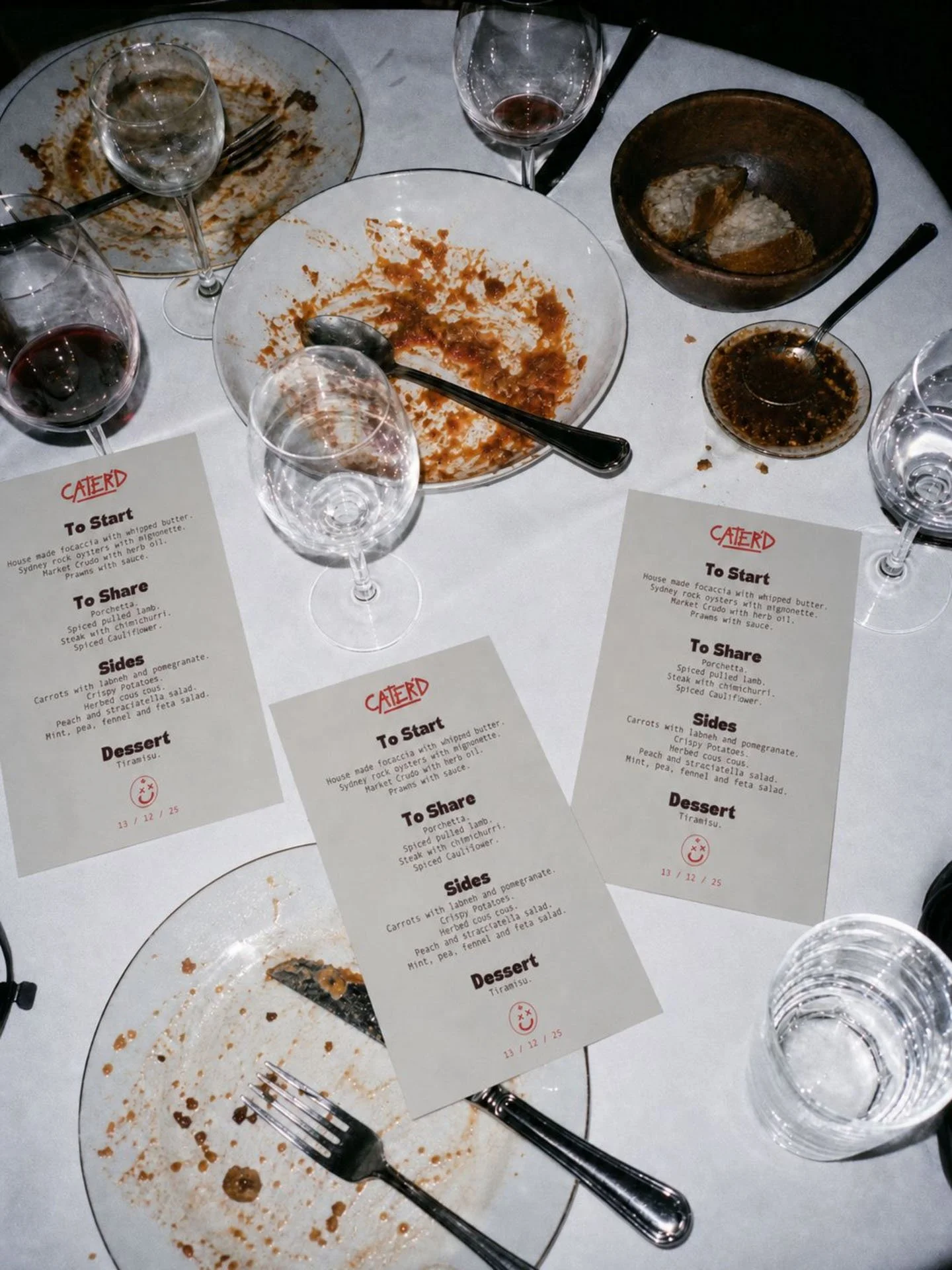
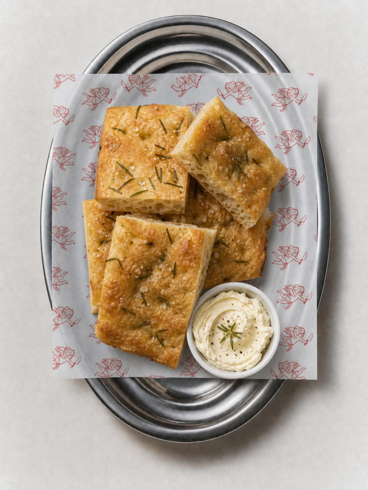
Most caterers look like a wedding invoice. We went the other way. The wordmark is hand drawn with a scrawled underline, like a chef writing the name on the pass. The apostrophe makes it feel finished. It's catered, you're sorted. The asterisk icon is a quick, loose mark for smaller spots. The red pattern of knife wielding cherubs on the paper liners adds some humour to the plate. Dark maroon and lime keep it bold, with sky blue and soft grey to cool it down. Photography is dark, moody and close up, with hands, plates and a lot of red.
The Brief.
The client wanted a modern catering brand for corporate drop offs, private events and weddings. Fresh, polished, easy. Not the old school buffet look. They also plan to scale into at home drop off boxes, so the brand needed room to grow.
What we did.
We named the business, then built the whole brand around it.
Identity, pattern, menus, packaging, uniforms and a website.
What we delivered.
Business naming
Primary logo and icon
Colour palette and typography
Menus
Paper liners
Embroidered aprons
Image direction
Website
Project details
Client: CATER'D
Location: Newcastle and Central Coast NSW
Services: Naming, brand identity, packaging, uniforms, website
Year: 2025
Photography: Second Nature Studio
Starting or scaling a catering business? We name, brand and build websites for catering, cafe and hospitality businesses across Newcastle, the Central Coast, Sydney and Australia. View our branding packages or book an intro call.